The Books Ngram Viewer from Google Labs provides a fascinating insight into language usage in the past 200 years. An Ngram is a series of one or more items from a sequence, in this case a word or phrase from a published text. Google’s viewer plots the frequency of occurrence for Ngrams found in books published since 1800. It is possible to narrow the search to specific collections of books or corpus. Available corpora include American English, British English, English Fiction etc. Researchers at Harvard University’s Cultural Observatory have put together some tips for using this data and have invented a new word
Culturomics – The application of high-throughput data collection and analysis to the study of human culture.
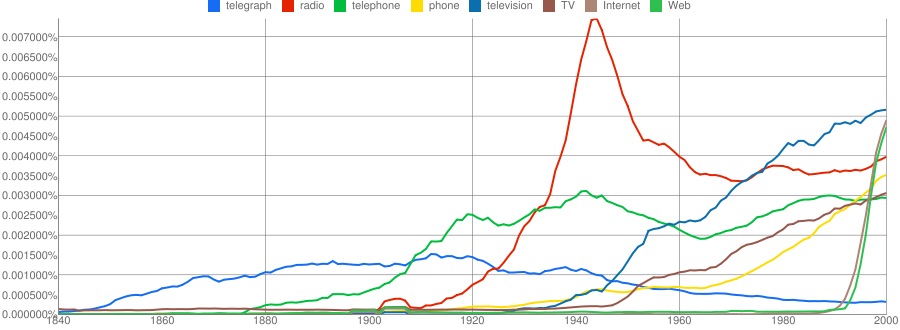
A plot of major communication technologies from 1840 to 2000 illustrates the power, and pitfalls, of the viewer. There are problems with synonyms; over time television has become TV, and telephone has become phone. To get a clear view all synonyms need to be plotted. It would be nice if google offered the option to add the data for two or more Ngrams so their combined frequency could be plotted with the same line (they seem to have fixed this now). But, the real problem comes with homonyms, “cell” and “mobile” do not always mean phone. The multiple senses of the word cell, for example, make it impossible to extract the one sense that corresponds to cellular mobile phones. If plotted on the graph above the frequency of usage of the undifferentiated word “cell” swamps all the other words, I have omitted it from the plot because of this. Despite these problems the plot clearly shows the rise and fall of communication technologies in the past 150 years. Looking at this plot, and others I created with the Ngram viewer, it struck me that what is actually being measured is the social impact or visibility of each Ngram. This led to the idea that this might be a great tool to assess the veracity of Gartner’s Hype Cycles. Gartner position themselves as the world’s leading information technology research and advisory company, claiming to deliver the technology-related insight necessary to make the right decisions.
When new technologies make bold promises, how do you discern the hype from what’s commercially viable? And when will such claims pay off, if at all? Gartner Hype Cycles provide a graphic representation of the maturity and adoption of technologies and applications, and how they are potentially relevant to solving real business problems and exploiting new opportunities. Gartner Hype Cycle methodology gives you a view of how a technology or application will evolve over time, providing a sound source of insight to manage its deployment within the context of your specific business goals.
Gartner.com Research Methodologies, Hype Cycles
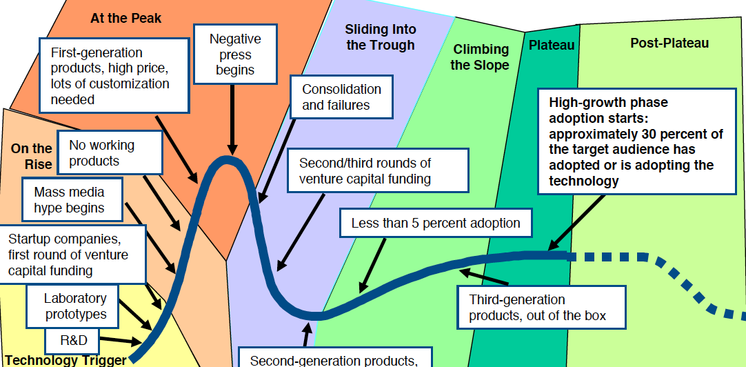
After some digging I found Understanding Gartner’s Hype Cycles, 2008 by Jackie Fenn for the outrageous sum of $495. Fortunately google found a free copy. The paper explains that the Hype Cycle is a combination of two curves, the first associated with early chatter about a technology, and the second associated with the actual adoption of the technology. The hype cycle is a measure of the general perception, or visibility, of a technology not its actual adoption. Gartner seem to be a little inconsistent about this, sometimes labeling the vertical axis “expectations” and sometimes “visibility”. The paper makes no mention of how the vertical axis of the two curves are normalized or why the first has a higher peak than the second. The paper has the following to say about how technologies are positioned on the curve.
Gartner analysts position technologies on the Hype Cycle based on a consensus assessment of hype and maturity. During the first part of the Hype Cycle, when there are many uncertainties regarding a technology, its position on the hype curve is guided more by its hype levels than its perceived maturity. At the later stages, as more information about maturity, performance and adoption become available, the hype plays a lesser role in determining the technology’s position on the Hype Cycle.
A technology may have radically different positions on different Hype Cycles. An enterprise’s ability to deploy a technology may exceed its ability to manage that technology well, resulting in different positions for the technology on, for example, the Hype Cycle for Application Development and the Hype Cycle for Enterprise Systems Management. In addition, different applications of a technology may lead to different positions — for example, speech recognition in the call center may be further evolved (on the Slope of Enlightenment) than speech recognition on the desktop (in the Trough of Disillusionment). Application considerations may lead to different positions of the same technology on different horizontal (for example, customer relationship management) or vertical (for example, government) Hype Cycles.
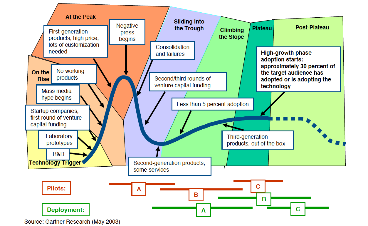
Below are two typical Hype Cycle diagrams labeled with the pompous names for the cycle phases. Trough of Disillusionment reminds me of The Pilgrims progress by Bunyan, sounding suspiciously like The Slough of Despond. Maybe Gartner, in their wisdom, think such pomposity builds credibility.
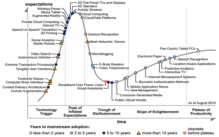
I find the Hype Cycle concept far too smug and subjective – ideal for MBA courses, but not much use in the real world. I can find no objective evidence in support of the claim that visibility or expectations for a technology are highest before it has reached more than 5 % adoption. I can find no evidence that successful technologies go through a visibility “trough” phase. Technologies appear to be positioned on the curve at the whim of Gartners “expert analysts”, and Gartner admit that different analysts will position the same technology in different places on different curves. Given all these admissions of subjectivity It amazes me that people are willing to pay for this nonsense.
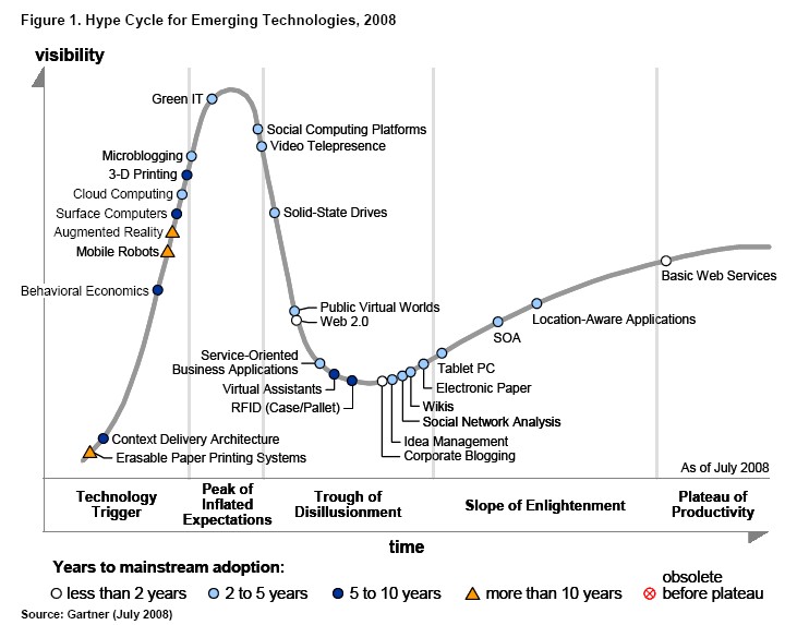
A nice example of the failure of the Hype Cycle is the positioning of Microblogging in August 2010. With the benefit of hindsight it is possible to see this as completely inaccurate. Twitter was just starting to gain “visibility” in August 2010. Within 6 months Twitter had been a cited as a causal factor in overthrowing at least three governments and supporting massive turmoil to the middle east. hardly a technology in the slough of despond!
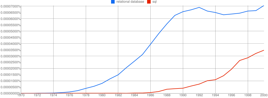
Relational Database Example
Relational database technology was first defined by Codd and Date in the late 1960’s and early 1970’s. It was commercialized in the late 1970’s by SDL which later became Oracle. The relational approach to data management became the industry standard and enabled Oracle to become one of the largest companies in Silicon Valley. As the graph below clearly shows; there was no “peak of inflated expectations” or “trough of disillusionment”. Relational databases took off and didn’t slow down for nearly 2 decades! I believe the flattening in the 1990s was probably due to their success. By the 1990s the qualifier “Relational” was no longer necessary – only non-relational databases needed a qualifier! Relational databases had become ubiquitous and banal, they were just databases.
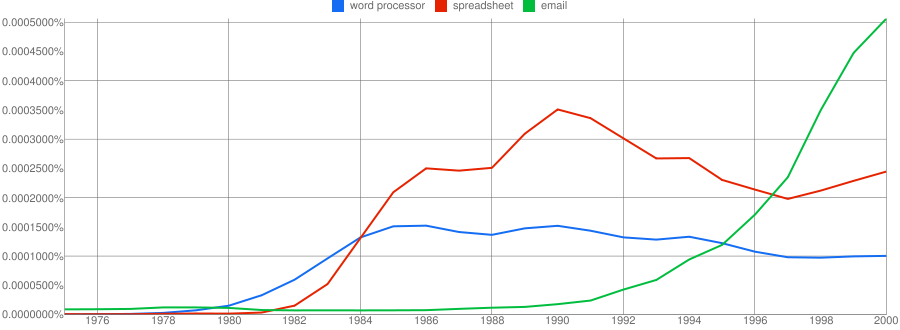
Desktop Productivity Applications Example
Wherever there is desktop computing there are word processors, spreadsheets and email. Since the introduction of VisiCalc in 1975, through Lotus 1-2-3, and Excel, the spreadsheet has grown in popularity. Word processors like wordstar, wordperfect and Word have have become equally ubiquitous. Both these technologies emerged in the mid seventies but took off with the spread of the personal computer in the 1980s. Email has grown with the rise of the internet. None of curves for these technologies look like a hype cycle.
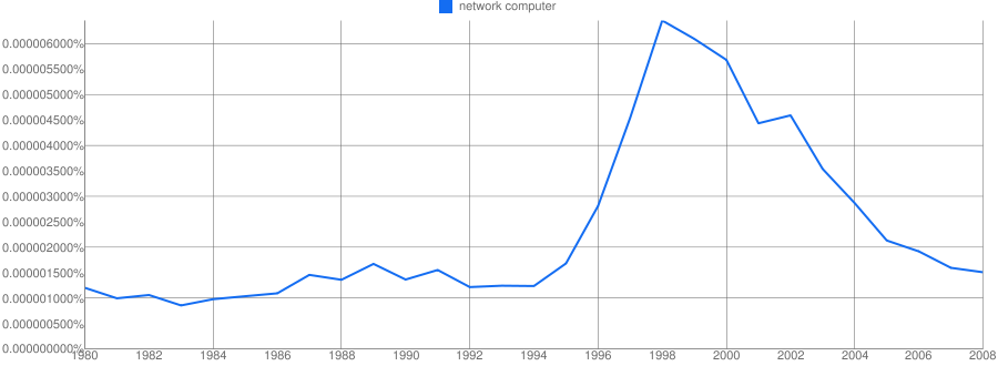
A Failed Technology Example
But what about failed tehcnologies? Technologies that were hyped but never made it. The technologies that Gartners analysts could save you from if only you’d listen to their sage advice. The Network Computer was a concept marketed by Oracle and Sun Microsystems in the mid 1990s. The concept defined a cheap diskless networked personal computer that downloaded its applications from the internet and stored it’s working files on internet servers. A sort of physical thin client. The interesting thing about network computers from my perspective is how long it took for the idea to die. Gartner suggest that visibility decays as fast as it grows but it clearly did not for the network computer.
I started investigating Gartner Hype Cycles with an open mind. But things started going downhill quickly. Gartner’s paper explaining the hype cycle concept cost $500 and is nothing more than flim-flam and arm-waving. Using the Google Books Ngram Viewer it is possible to plot quantified graphs of a paricular terms “visibility”. By carefully selecting terms the “visibility” of a technology over time can be plotted. These plots should look like Gartner Hype Cycles but they don’t. Gartner’s Hype cycles are a sham, the information technology equivalent of snake oil.